AI Integration Quick Reference
AI Integration Quick Reference
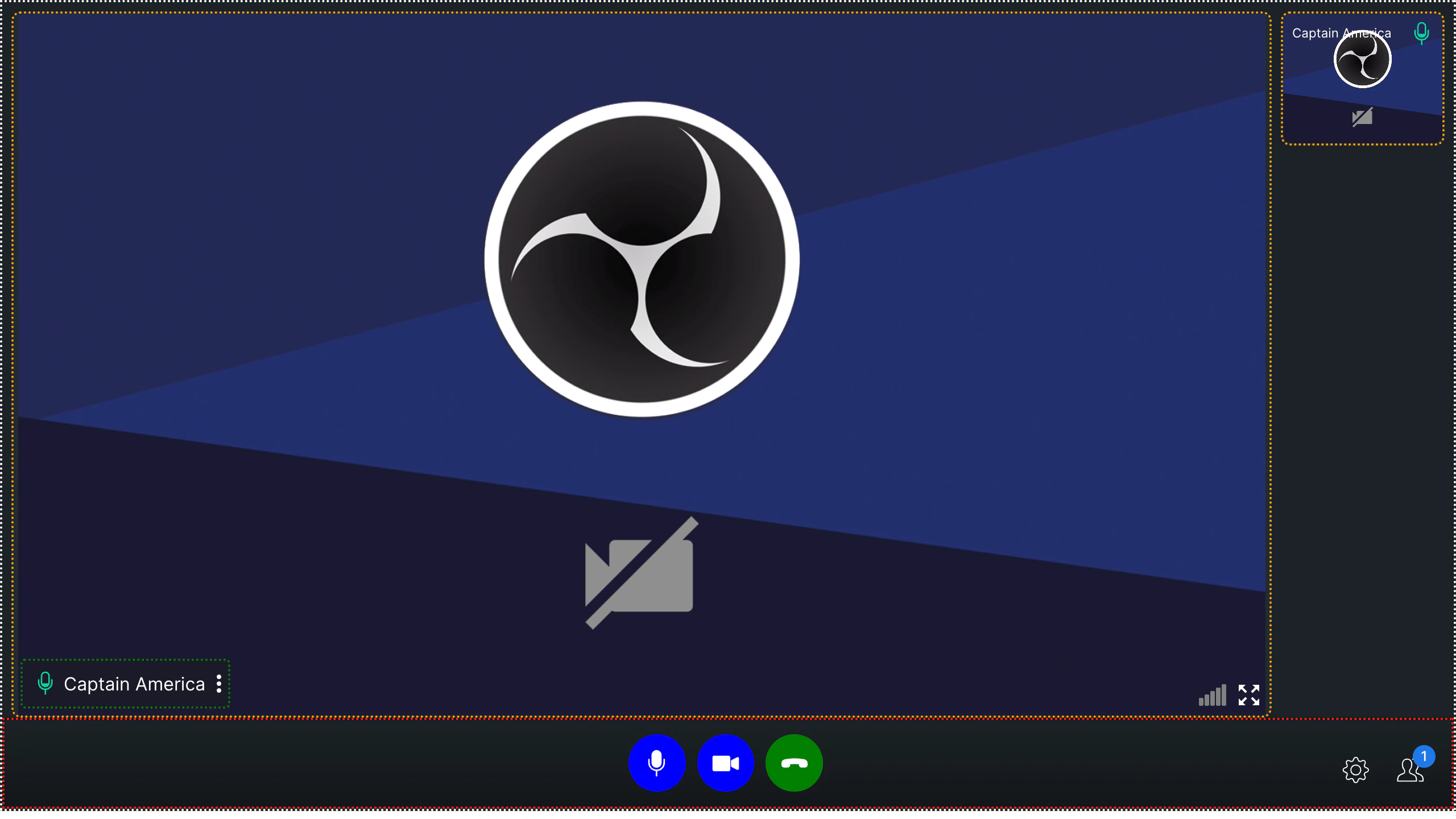
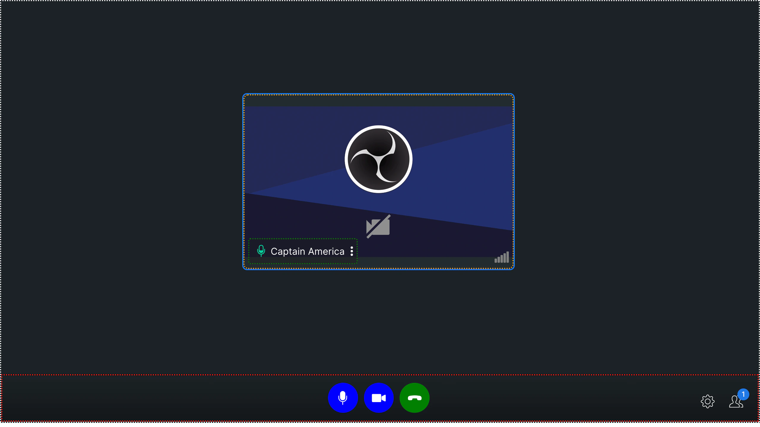
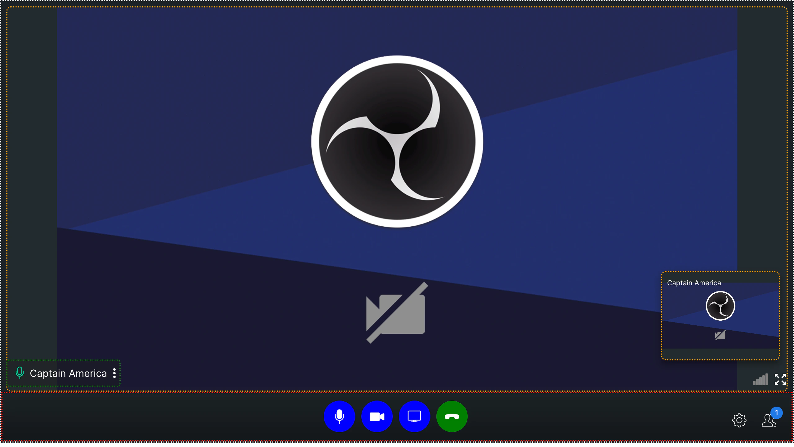
DEFAULT | TILE | SPOTLIGHTCommon CSS Classes
These classes are available across all call modes:| Class | Description |
|---|---|
cc-main-container | Outermost container for the calling component |
cc-bottom-buttons-container | Bottom bar containing action buttons (mute, end call, etc.) |
cc-name-label | User name text container |
cc-video-container | Video feed container |
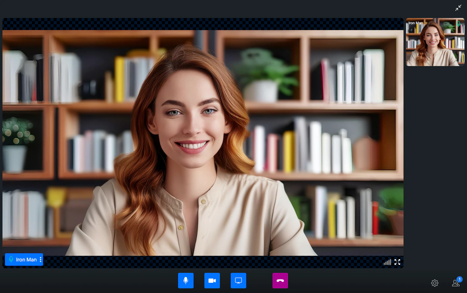
Bottom Buttons
| Class | Description |
|---|---|
cc-bottom-buttons-container | Container for all action buttons |
cc-bottom-buttons-icon-container | Individual button wrapper |
Individual Button Classes
cc-audio-icon-container— Audio toggle buttoncc-audio-icon-container-muted— Audio button (muted state)cc-video-icon-container— Video toggle buttoncc-video-icon-container-muted— Video button (muted state)cc-screen-share-icon-container— Screen share buttoncc-switch-video-icon-container— Switch camera buttoncc-end-call-icon-container— End call button
Example
- CSS
DEFAULT
TILE
SPOTLIGHT
- CSS
Guidelines
- Only use CSS classes documented here — custom classes may cause UI issues
- Avoid resizing the grid container to prevent layout distortions
Next Steps
Video View Customization
Customize video call layout and participant tiles
Virtual Background
Apply blur or custom image backgrounds during calls
Presenter Mode
Enable screen sharing and presentation mode
Calling Overview
Overview of all calling features and approaches